Pacing Sheet
Where to find the Pacing Sheet
You can access the Pacing Sheet by clicking onPacing
in the Analytics section. Or by navigating directly to the Pacing sheet.
Check the Metrics Dictionary to understand the precise definition of all of these metrics.
Understanding the Pacing Sheet
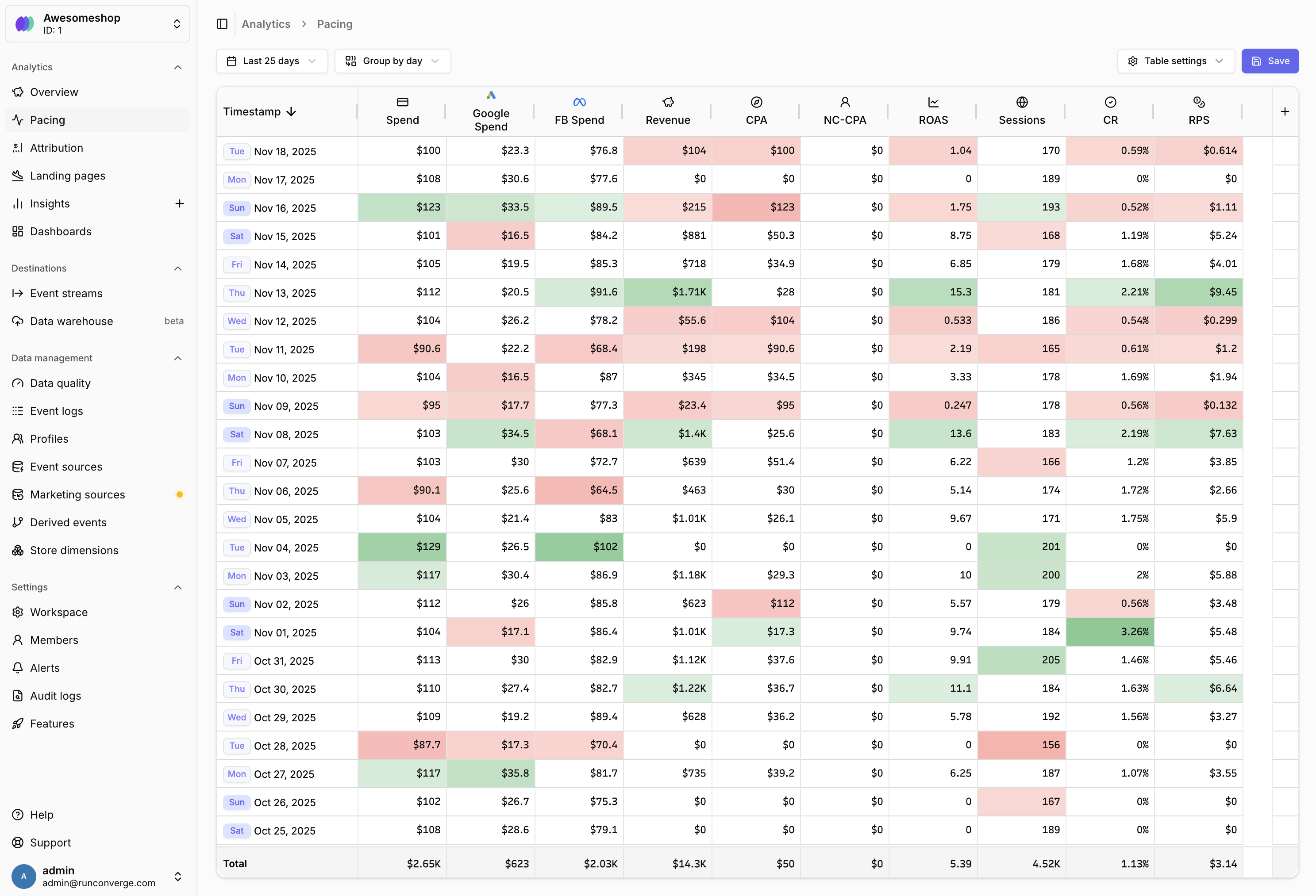
The Pacing Sheet replaces your daily spreadsheet with up-to-date, accurate data directly from Converge. Track your marketing performance over time to spot trends and anomalies in real-time. Your marketing data is displayed in a table format where:- Rows represent time periods (day, week, month, or hour)
- Columns represent metrics (e.g., Ad spend, Revenue, ROAS)
- Cells are color-coded to highlight performance relative to the selected date range’s average
- Totals row at the bottom shows totals or averages for each metric
- Green cells: Performance above the average
- Red cells: Performance below the average
- Intensity: Darker colors indicate larger deviations from the average
Customizing the Pacing Sheet
You can customize the Pacing Sheet by adding metrics, adjusting the date range, changing time granularity, and configuring display options.Add a metric
Add a metric
You can add metrics from predefined categories or create custom calculations.Add a built-in metric
- Click the button in the rightmost column of the table
- Select a metric section (e.g., Blended, Facebook, Google)
- Choose the specific metric you want to add
- Optionally customize the metric name and icon
- Click Add to add the metric to your table
- Click the button in the rightmost column
- Select a metric channel (e.g., Facebook, Google)
- Select Conversion metric from the metric dropdown
- Configure your custom calculation using event names and aggregations
- Set a name and icon for your metric
- Click Add to add the metric to your table
Remove a metric
Remove a metric
- Hover over the metric column header you want to remove
- Click the menu icon that appears
- Select Remove from the dropdown menu
Re-order columns
Re-order columns
You can reorder metric columns by dragging and dropping them.
- Click and hold on a metric column header
- Drag it to the desired position
- Release to drop the column in its new position
Configure color coding
Configure color coding
Color coding helps you quickly spot trends and anomalies. You can customize how colors are displayed.
- Click Table settingsin the top right
- Choose a color coding mode:
- Show positive and negative colors: Highlights both high and low performance
- Show only positive colors: Highlights only above-average performance
- Show only negative colors: Highlights only below-average performance
- Disable color formatting: Removes all color coding
- Changes are applied immediately
Use compact notation
Use compact notation
Compact notation displays large numbers in a shortened format (e.g., 1.52K instead of 1,523.23).
- Click Table settingsin the top right
- Toggle Use compact notation on or off
- Changes are applied immediately
FAQ
How does color coding work?
How does color coding work?
Color coding uses statistical analysis (z-scores) to compare each cell’s performance against the selected date range’s average for that metric.
- Values that are significantly performing better than the average are highlighted in green
- Values that are significantly performing worse than the average are highlighted in red
- The intensity of the color indicates how far from average the value is
- Values close to the average remain uncolored
Why don't I see any data in my Pacing Sheet?
Why don't I see any data in my Pacing Sheet?
If your Pacing Sheet is empty, check the following:
- Date range: Make sure your selected date range includes dates with data
- Marketing sources: If you’re tracking ad platform metrics, verify your marketing sources are connected
- Time granularity: Try changing the time granularity (e.g., from day to week) to see if data appears
Can I export my Pacing Sheet data?
Can I export my Pacing Sheet data?
Full export functionality is coming soon!
Can I create different Pacing Views?
Can I create different Pacing Views?
View functionality (similar to attribution) is coming soon!
How do I include comparison percentages (e.g., DoD)?
How do I include comparison percentages (e.g., DoD)?
Full comparison functionality is coming soon!
How is the Pacing Sheet different from the Attribution Report?
How is the Pacing Sheet different from the Attribution Report?
The Attribution Report shows performance by channel, campaign, ad set, or ad. The Pacing Sheet shows performance over time, making it ideal for:
- Performance tracking over time
- Spotting trends and anomalies
- Comparing performance across different time periods
- Replacing manual spreadsheet tracking