Visualization Types
Changing the Visualization Type
You can change the Visualization Type using the Visualization Type Picker as per the screenshot below: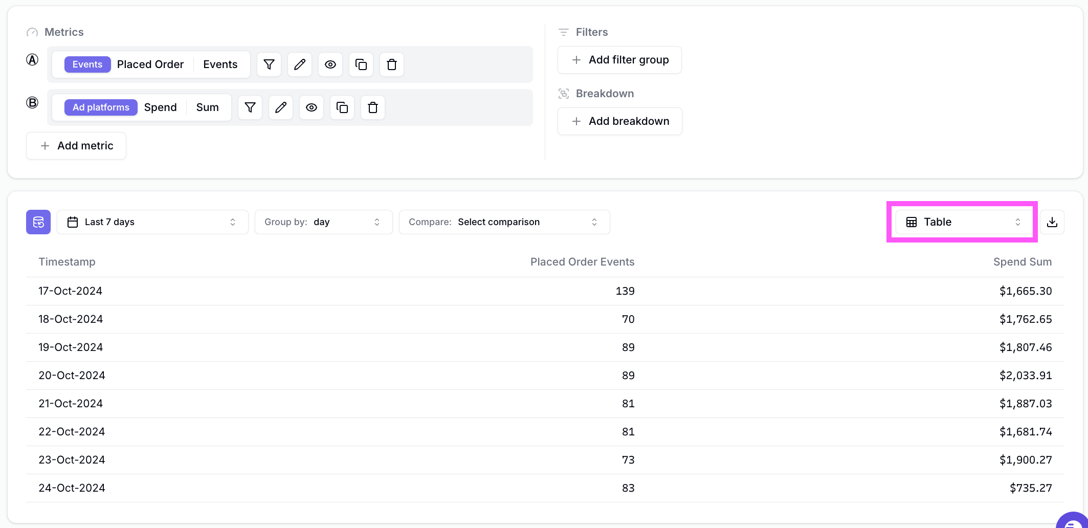
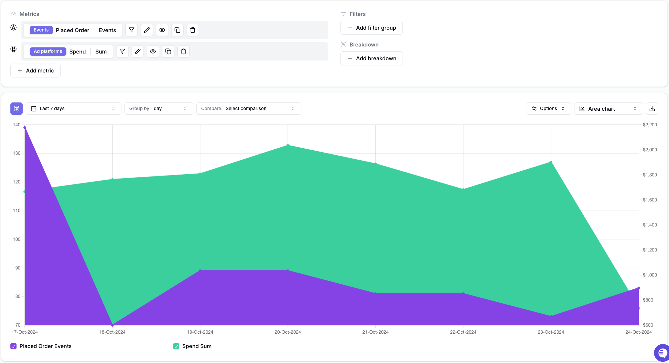
Time series visualization types
Time series Visualization types show you how metrics change over time.Table
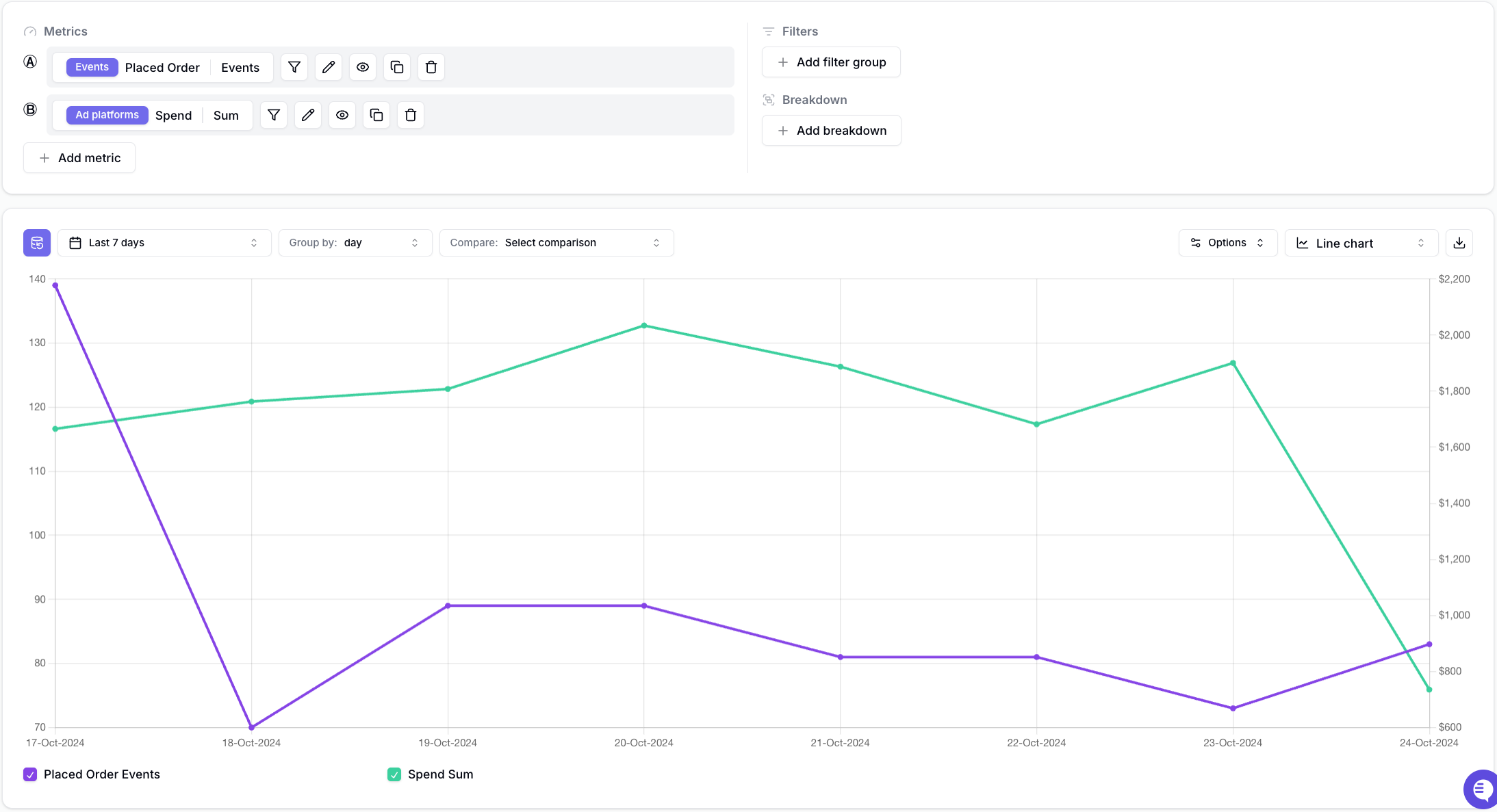
Line Chart
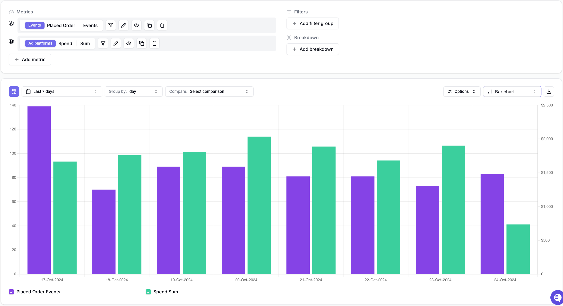
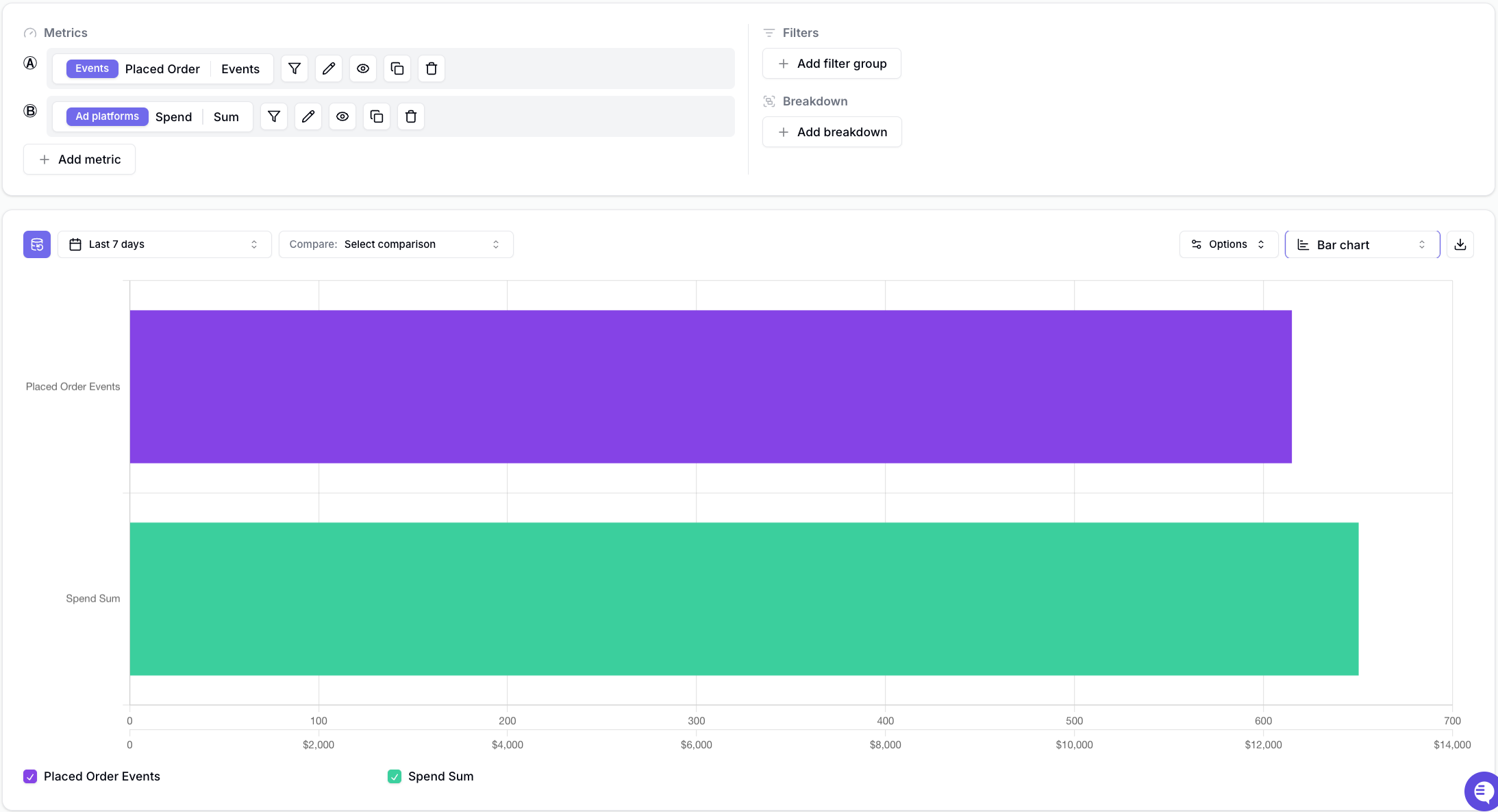
Bar Chart
Area Chart
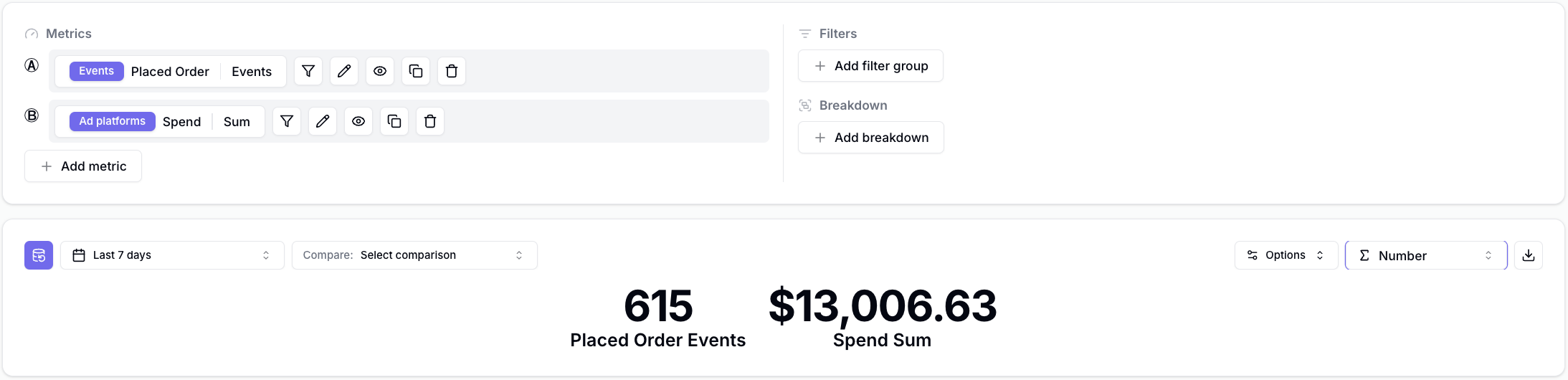
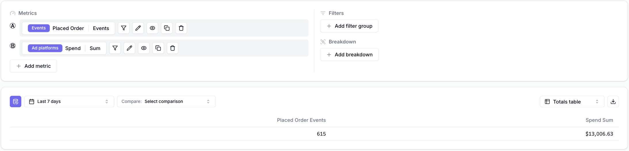
Totals visualization types
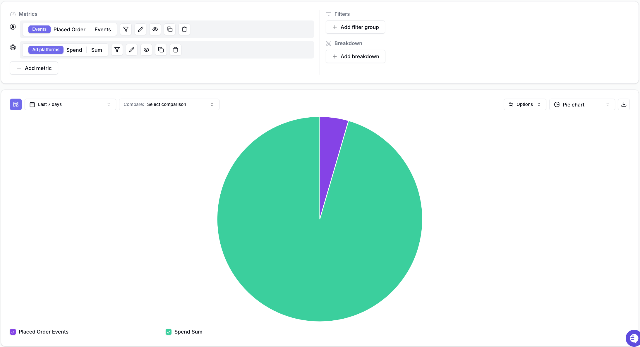
Totals visualization types show you the total value of metrics over a specific period.Totals Number Chart
Totals Table
Totals Bar Chart
Totals Pie Chart
Visualization Options
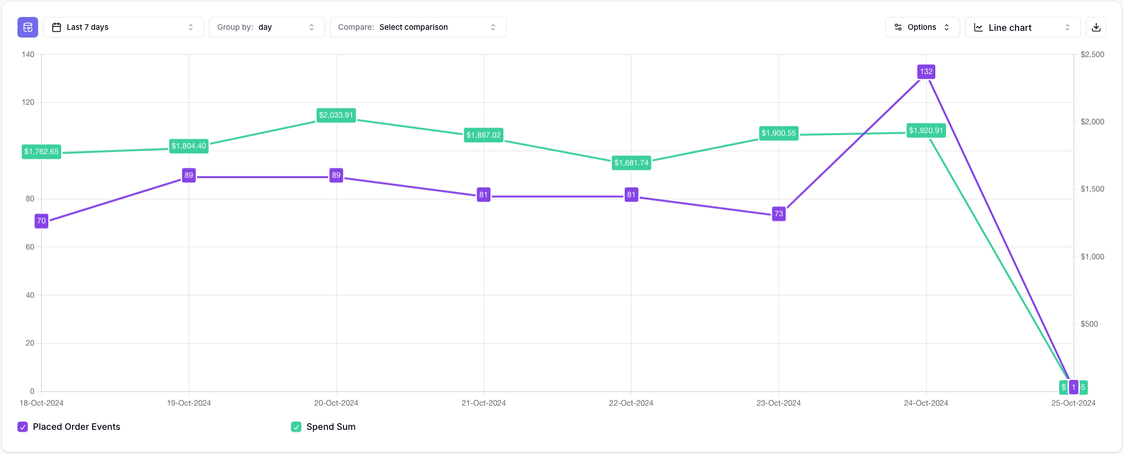
Show values
The Show values visualization option allows you to add labels to each line-chart data point. As an example, observe the following insight without any labels.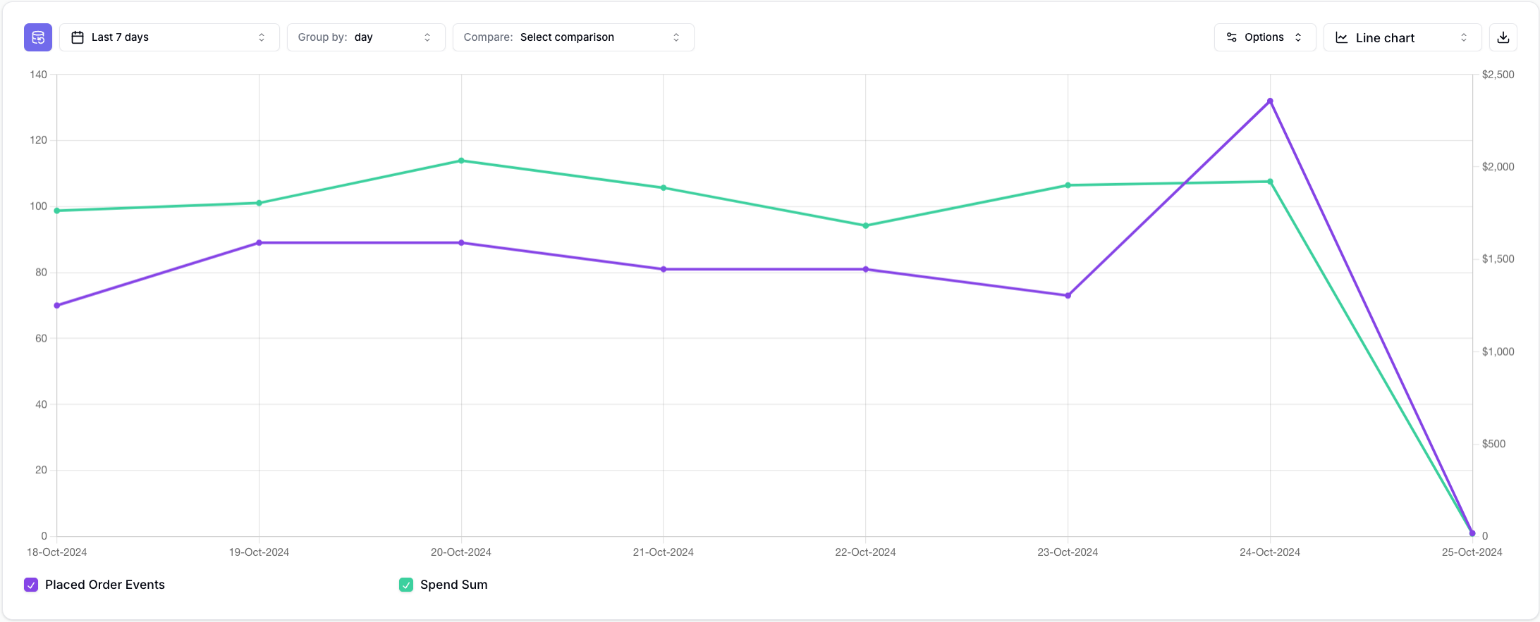
- Click on Optionsin the top right corner of your insight.
- Tick on Show values
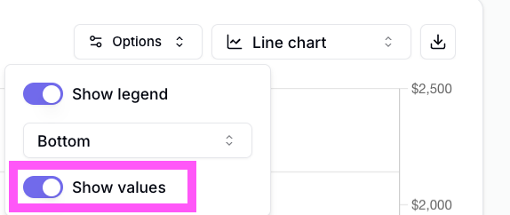
- Done.
Legend
You can choose to optionally Hide the legend or move it to the Top, Bottom, Left, or Right of the insight. To configure:- Click on Optionsin the top right corner of your insight.
- Choose whether you want to show the legend and where.
- Done.